I have decided to keep my cover simple. The reason for this is due to the fact that i do not want my cover to be too off putting. It is clear from looking at the cover that the artist is named 'Erin Evans' and her song is called 'Colours'. I kept my text white because both of my style models have white capitalised text. The white bold text stands out well against the darkened image; the 'drop-shadow' effect helps create the contrast.

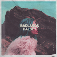
 To the left is Halsey's track cover, and to the right is Lady Gaga's. The two artists are both popular and share the same kind of audience due to Gaga and Halsey's are both pop artists. I idolise the two artists strongly; i have a passion about both their music so it would be a personal touch to add resemblance to my work. In comparison to Halsey's 'BADLANDS' cover, and Lady Gaga's 'JOANNE' cover there are similarities to my cover. In my cover I am centre of the entire cover just like my two style models. My background is empty and has no distractions. The colour of my background is intentionally duller and a darker tone than my text. The reason for this is that it allows the solid white to stand out against the blue-grey tone of colour. Admittedly, I got this idea from 'JOANNE'. However, I believe there is difficulty in reading 'LADY GAGA / JOANNE' on her cover due to the two light tones of colour. This inspired me to add in the 'drop-shadow' effect on to my text. This gave my text more volume; the text now stands out a lot more and it does grab the audiences attention.
On my cover, I am standing on my side and giving the camera direct mode of address. This is not something I took from my style models. The reason I look directly in to the camera is because it draws the audience in. It makes them feel involved, just like you would give eye contact to another person in conversation. I have no negative expression on my face, i am pulling a slight smirk. My eyes look as though i am happy. This will make the audience drawn to me, as apposed to me pulling an angry face - as that would make them feeling threatened.


